From glow to gloss: how miensk lost some signs and gained others
The image of Miensk as a city from a Soviet postcard, already fragile, falls apart even more if you look closer at its signage and outdoor advertising. This is an aspect of urban space where history, especially that of the Soviet era, has been thoroughly dismantled in a very literal sense. At the same time, diversity and deregulation that replaced standards, do not always have a positive impact on the city’s outlook. The article below discusses why this happened and how today’s landscape of outdoor informational surfaces in Miensk took shape.
Urban signage on shopping malls, landmark structures, and food or cultural venues rarely provokes a level of public debate comparable to that surrounding new buildings, squares, parks, or metro lines. Signage is smaller, mostly functional, and it rarely conveys ideology clearly through its formal parameters. Simultaneously, signs and signage are an important element of the urban environment. They often affect us on a more intuitive level, evoking certain associations. Who of us does not recall the image of curved neon lettering on the façades of Soviet-era cinemas, or casino advertising of Las Vegas, composed of hundreds of coloured bulbs? Or at least the letter M on a matte background that marks subway entrances?
In today’s Miensk, the web of associations is undoubtedly changing, and new layers of signage are being added atop the old, sometimes mixing, sometimes replacing them. Some have hopelessly aged yet, still hang in place. Supermarket and restaurant chains, social advertising on billboards, signs for pharmacies, schools, hospitals, and colleges, inscriptions on bus stops... what kind of landscape do they form in the Belarusian capital? And what does their design tell us?
History
It’s not exactly known when signs first appeared, but the process can certainly be linked to the emergence of market relations. Artisans placed symbolic signs near their workshops: shoemakers showed sandals, bakers demonstrated clay bread, winemakers displayed bunches of grapes. These images served as a symbolic language clear to everyone, because reading was a universal skill.
In the Middle Ages, signage became an indispensable attribute of a European city. As trade developed and artisan numbers grew, so did the need to stand out among competitors, so forged metal or painted wooden signs appeared on the facades of countless shops and hotels. A cat-shaped sign often symbolised a wine vault, while three hammers signified a smithy. Historically, for example in England, it was often the signs themselves that inspired names. Thus, pub names like The Red Lion or The White Horse originate from old signage.
In the Early Modern period, as book printing began to develop actively, signs took on a more textual character. When ordering a sign for their store, the merchant would ask to indicate the store’s name, that of the owner, and the range of goods offered.
By this time, England had already seen the emergence of the forerunner of the modern urban design code. This was due to the fact that in 1666 a fire broke out in London, destroying a quarter of the city’s buildings. After the fire, architect Christopher Wren developed a master plan for a new city with straight broad streets and squares. According to the architect’s vision, houses were to be built using red brick and set at a distance from one another, while new standards for signage called for abandoning bulky informational structures, in order to reduce the scale of destruction in potential emergency situations.
The history of signage in Miensk is connected with its rapid development in the 19th century in the context of the industrial revolution. Although after the partitions of the Polish—Lithuanian Commonwealth Miensk was regarded rather as a provincial town, Russian and local industrialists understood its advantageous position midway between Moscow and Warsaw. Large commercial enterprises and organizations whose buildings were often located centrally began to appear in the city.
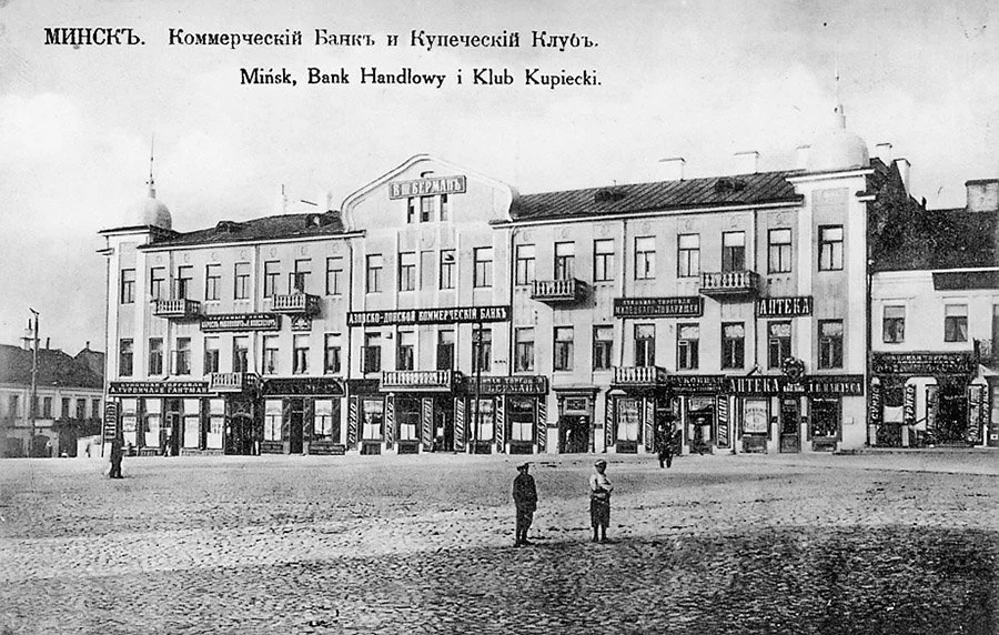
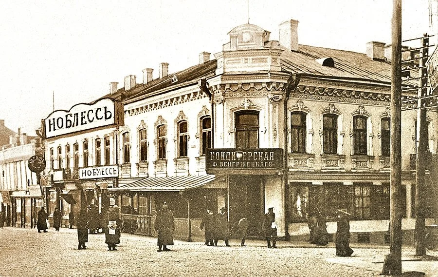
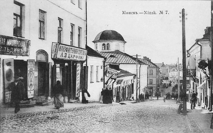
Photographs of Miensk at that time contain signs of manufactories and pastry shops, usually made of metal, with texts in Russian in pre-reform spelling, located exactly above the entrance.
In the city, a building usually housed several shops or government institutions. The stylistic treatment of the signage was mostly uniform, with the use of the owners’ surnames. You won’t find anything like this in Miensk today.
The Soviet Era
Studying the period of Soviet modernism helps to better understand and interpret the contemporary design code of the capital’s streets. Appearance of neon signs became emblematic of the 20th century. They originated in France and reached the Soviet Union in the mid-1930s. In Miensk, they became widespread much later, that is, after the Second World War and the celebration of the city’s 900th anniversary.
Signage was strictly regulated by the state. In major cities, this was handled by factories producing illuminated artistic works (Moscow), as well as the ‘Gazsvet’ (Leningrad) and ‘Rigasvet’ (Riga) factories. In Miensk, this was not systematised as a form of production, so for a long time the signs were made by small workshops consisting of artists and designers. A dedicated organization for artistic and creative decoration of urban space appeared in Miensk only in 1985.
Advertising signs were commissioned not only by state officials responsible for trade and social services, but also by major enterprises such as Aeroflot, Intourist and others
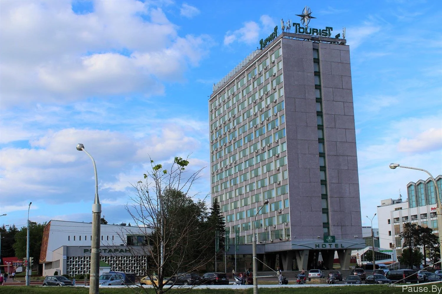
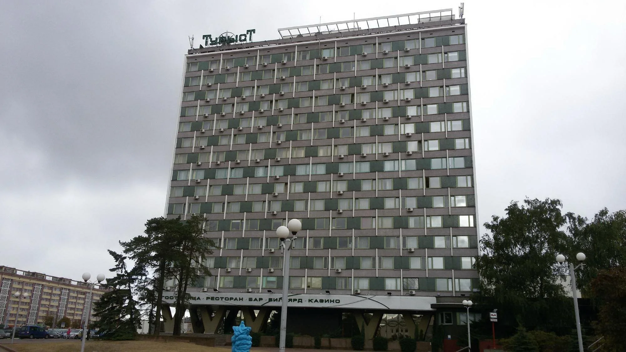
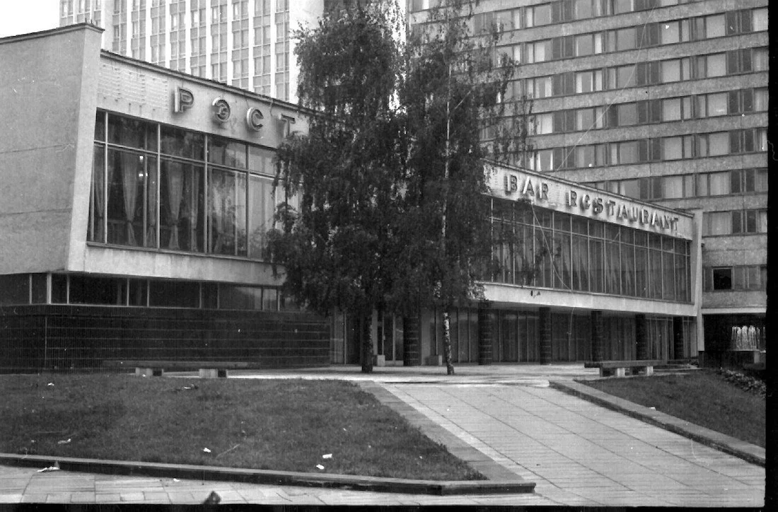
A characteristic feature of major Soviet cities in the 1970s, including Miensk, was the large number of foreign visitors, for whom signage of the city’s key institutions was also duplicated in foreign languages. The Tourist Hotel in Partsizansky Avenue built in 1973 is an illustrative example. At the hotel’s request, its nameplate and the restaurant signage were duplicated in three languages (Belarusian, Russian and English), something rarely encountered today. Overall, the Belarusian language was sparsely represented on signage in the BSSR, even compared to present day Belarus.
Neon signs in the form of various silhouettes were quite widespread, since it was not always necessary to use letters or words to indicate a public venue. It was often enough to display the necessary symbols to create and reinforce associations with particular goods and services. Therefore, while working on their sketches, some artists tried to accurately depict the necessary object. For instance, an image of a treble clef, several notes, or a musical instrument unmistakably refers us to musical goods. One can recall the 1965 film ’Lyubimaya’ (‘Beloved’), shot in Miensk, where one can see a gas-lit sign featuring the image of a person crossing the street, with the caption below: ‘Driver, beware of pedestrians!’. Most likely, there was a kindergarten or school nearby. Such signage is not used in traffic regulation anymore. In efforts to prevent accidents near children’s institutions, road signs bearing warnings such as ‘SCHOOL’ and ‘CAUTION, CHILDREN!’ became more widely used.
A scene from the film 'Lyubimaya' (‘Beloved’), released by Belarusfilm in 1965 (Source)
From the point of view of urban design, such emblems created a multidimensional spatial perspective, making the city even more vibrant and energetic.
The greatest development in the typographic history of signs in Miensk occurred in the 1960s. Artists got the opportunity to experiment and began to draw inspiration from the work of their colleagues from other major Soviet cities. Thus, the 1960s were marked by delicacy, while the 1970s were defined by graphic clarity and rigor. In the 1980s, information and advertising signage filled the entire city, enforcing diversity in the typeface style.
Simultaneously, the Soviet era of Miensk’s history was marked by strict regulation of almost everything. This also applied to the decorative design of the city’s facades and buildings. Entire manuals and guidelines were published on how to produce and install signs. National Library’s archives still hold regulations for illuminated signs, though these were for the Russian Soviet Federative Socialist Republic (RSFSR) (it is hard to say for certain whether a separate set existed for the Belarusian Soviet Socialist Republic (BSSR)). Currently, this practice no longer exists, and we can observe how the city has been taken over by urban design elements that are not coordinated by the relevant specialists.
Interestingly, in many cities of the European Union, signage and outdoor advertising are quite heavily regulated: both at the local and national levels, the norms of city decoration are fixed. In Salzburg, for example, all outdoor advertising is subject to the mayor’s law, which prohibits modern signage. Instead, signs are made of metal. This is due to the architectural features of the city: metal is considered much more suitable for decorating the facades of old buildings. One of the oldest streets in Salzburg is famous for its medieval houses, which today host trendy concept stores and cultural institutions. That is why, in order to open a restaurant there, McDonald’s significantly altered the concept of its signature plastic sign, adorning its logo with wrought-iron flowers with petals.
Photo of a McDonald's sign in Salzburg (Source)
The Period of Independence
The post-Soviet period in Belarus was far from homogeneous when it came to signage. At the very least, the regulatory framework changed (that is, who authorises a particular sign and how), as did the technology (new materials, printing methods, etc.) and linguistic practices (waves of Belarusisation alternating with waves of Russification and campaigns against the Latin script).
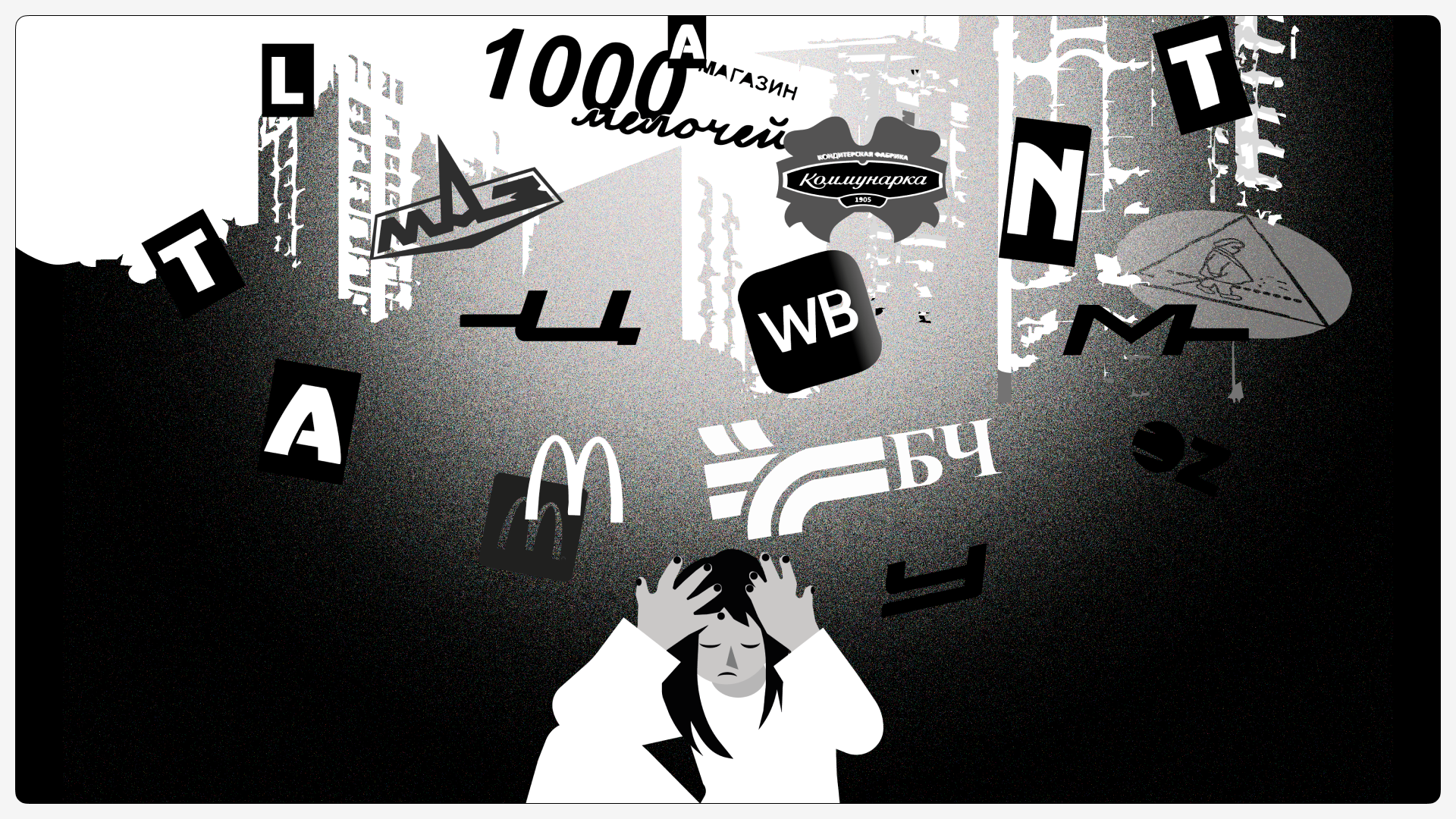
What characterizes Miensk’s signage landscape today? Perhaps above all its fragmentation, weak regulation and general lack of memorability. Many specialists point first and foremost to its unattractive features. They note the sheer number of garish advertising and informational elements, haphazardly scattered across the facades of residential and public buildings. As a result, the city often resembles an organism covered in random growths. Alongside that, some will probably name obsolete designs, low-quality materials, and overall wear and tear. All too often, insufficient time and money are invested in the design of signage, and little thought is given to how it might be integrated into the overall composition of the building. At the same time, this is the kind of signage that often appears in the city’s main streets.
Various social and public service institutions have remained in Miensk from the Soviet past, serving residents for decades. However, their signageofte n changes even if the building’s architectural outlook is preserved. A telling example is the ‘1000 Drobiazhei’ (‘1000 Little Things’) shop, which has been located in Kalinina Street since 1967. Archive photographs demonstrate a sign that in its decorative and artistic design is characteristic of Miensk of the late 1960s.
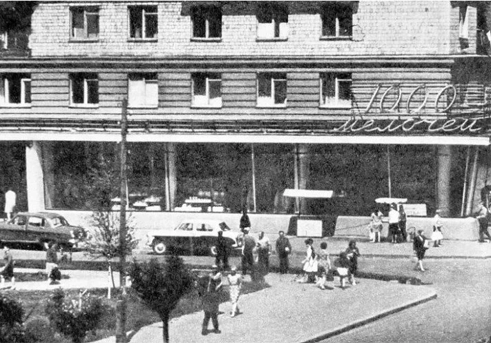
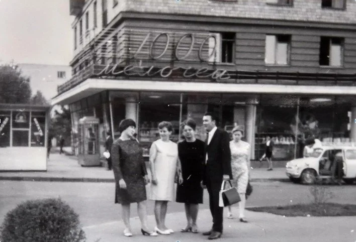

The sign sits naturally within the overall architectural composition and is seamlessly integrated with the shop’s glazing, while its typographic design reflects the unmistakable style of its era. It is worth noting that the sign was lit in the evenings and functioned for quite a long time.
The metamorphoses of urban space are inextricably linked to the political and economic aspects of the country’s development on a more general scale. Soviet signage did not survive the 1990s, and the ‘1000 Drobiazhei’ (‘1000 Little Things’) sign is no exception. In 2025, the sign presents a kind of homage to the past: it shows an attempt at playful typography, creating a contrast with the neighbouring ‘Haspadarchyja Tavary’ (‘Household Goods’) sign, executed in a conventional manner without any artistic intent.
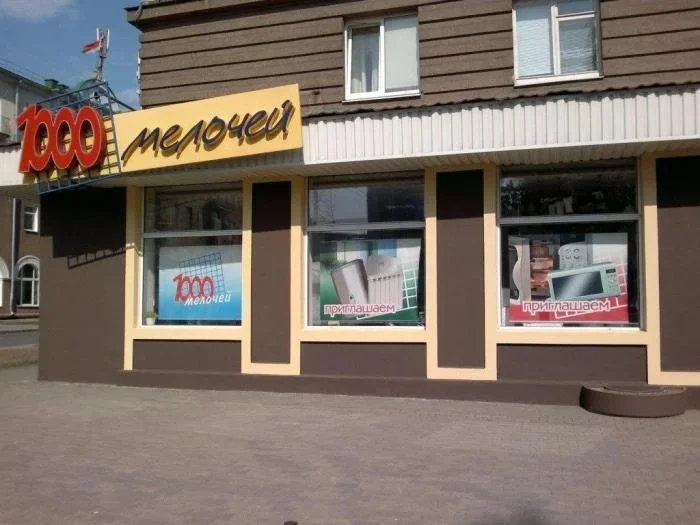
The sign of the ‘1000 Drobiazhei’ (‘1000 Little Things’) shop
Photographs are courtesy of the author
After the collapse of the Soviet Union, centralised facade decoration in Miensk largely disappeared. There is a state-owned organization called ’Minskreklama’ (‘Miensk Advertising’) that is tasked with decorating the city on festive occasions and celebrations, but there are no specific guidelines on decorating facades for small businesses. It is somewhat reminiscent of the 1990s, when state regulation was minimised in many areas, while entrepreneurs gained a wealth of new opportunities. In Miensk, a sign to promote a business or enterprise can be made to suit any taste and budget. Most signs are produced by small private workshops, which often also work in areas such as printing and design. Some hire a dedicated designer, commission a sign from an expensive workshop, and aim to integrate it into the overall context of historic architecture. Furthermore, an outdoor sign is a complex technical product that requires knowledge of electrical engineering, as well as an understanding of the physical and chemical properties of modern materials. To conceptualise a sign, one needs a sketch showing the facade’s measurements and a clear idea of what the client wants. The signage chosen by clients most often fails to meet the stylistic standards adopted, for example, in most other Central and Eastern European countries. Poor-quality plastic backing, garish typography and colour combinations that run counter to established design principles create a kind of visual noise that makes you want to retreat to a calm space free of advertising.
Naturally, Miensk’s signage landscape varies from district to district. Take, for example, residential areas, including Soviet-era housing estates and large new developments still under construction, such as Minsk-Mir (Miensk-World). These areas of the city feature a large concentration of businesses offering various services. To promote them, business owners resort to various communication channels, including social media, advertising in public transport and print media, as well as signs on building facades. At the same time, chain businesses visually link these different districts together. Imagine a chain store with branches located all over the country. Here is a classic illustration of a flashy advertising sign in Miensk: a large sign executed in a black, white and beige palette, set against a random backdrop, alongside lettering that disappears into the background. To make sure passers-by stop and look, the shop covers its windows and doors with thick paper bearing the same lettering, as if aware that it might not be remembered at this location the first time round.
Or, for instance, what does an ordinary building with several businesses look like in almost every neighbourhood of Belarus’ capital? No doubt that the architecture of the building in which the small business is located plays an important part. Here, we are usually met with ‘off-the-shelf’ solutions: ventilated facades, panes of glass in ostentatious colours (for example, blue or gold), and an abundance of plastic. Predictably, against this far from attention-friendly backdrop, the bulky lettering of major online marketplaces and chain stores sprawls across the scene. At the same time, small businesses also try to make themselves visible, mounting signs, sometimes of considerable size, on building facades and using a variety of decorative elements, predominantly plastic, with a short lifespan. Most likely, they will be in the brightest and most varied colours, with each sign competing to draw attention to itself. They might be red, purple, white, green, or any other colour a business decides to go for. More often than not, the building itself disappears behind them. Signs from different eras coexist side by side, yet they fail to form a coherent whole: there is no sense of historical continuity, nor any city-level identity holding them together.
Signage example (Source)
Nevertheless, it is not a matter of building specifics or government regulation solely. It is hardly surprising that the city is generally indifferent as to whom commercial premises are leased, while tenants often lack both specialist training and a detailed understanding of the city’s history. But how is it that, overall, despite decades of mass travel abroad and countless borrowings in the fields of economics, infrastructure and marketing, the layer of signage remains so resistant to change?
It appears that several factors overlap here: the role of design and designers in planning practice in Belarus; the way already occupied buildings are administered; and perhaps also the rapid shift of commerce into the online realm.
Positive Exceptions
There are also examples of interesting signage in Miensk, whose creators were clearly inspired by business and cultural quarters defined by a cohesive visual style. Accordingly, a distinct approach to signage design can be observed in places such as Karl Marx Street, Internatsiyanalnaya Street, Engels Street, the area around Victory Square and, of course, Independence Avenue.
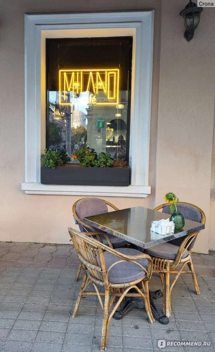
Take, for instance, a cafe that, judging by its name, specializes in Italian cuisine. Its sign glows with warm yellow neon, reminding of the cozy Italian streets. Its laconic design and soft glow bring about the atmosphere of a Milanese evening, stylish, calm and welcoming. Through a window decorated with plants, the light of the sign seems to invite you inside to enjoy the aroma of freshly brewed Italian coffee. The sign does not scream for attention and fits into the street’s overall ambience, without overshadowing other businesses, whose signs cover half of the building’s façade.
Here is another restaurant, this time specializing in Mediterranean cuisine. The decorative lettering is so large and so untypical for the city that it seems to transport the passers-by to a Mediterranean neighbourhood, drawing the eye and inviting them inside. Importantly, the sign does not seek to compete through size only. Unlike much of the outdoor advertising found across the city, it is not made of cheap plastic but of flexible neon tubing and is clearly underpinned by a well-considered concept.
However, on a general scale, examples like that are not many in number. Miensk lacks a coherent ‘design code’ developed in collaboration with specialists in urban studies and the city’s history. Signage in the Belarusian capital of the 2020s largely sends us back to the 2000s, when the first waves of big money flowed into the country and small businesses gained access to new resources.
Outdoor signage is part of the city’s visual culture, a reflection of its time, its tastes and its technologies. When both international and domestic tourists come to Miensk, they absorb the city’s aesthetic, weighing up whether they want to return and spend their money in its cafés. Belarusian audiences may be used to this and have limited points of visual comparison. For foreign visitors, however, these incongruous additions to not always carefully restored historic buildings become just another detail reinforcing the image of the capital as exotic and eccentric, but worth visiting only once.
It is hardly possible to draw broad generalisations or firm conclusions about the contemporary signage landscape in Miensk. In the nineteenth and twentieth centuries, when outdoor advertising was centrally regulated by the state, visual patterns were more clearly defined and reflected how experts understood aesthetics in a given historical period. In the post-Soviet period, as the dimension of small and medium-sized business was deregulated, signage and outdoor advertising have come to reflect a kind of visual cacophony in which, from an expert perspective, it is difficult to discern anything truly beautiful or tasteful. On the surface, Belarusian urban space can appear orderly, clean and well maintained, evidenced by freshly painted facades, neatly plastered walls and carefully swept pavements. Yet aesthetic refinement, visual awareness and alignment with contemporary design trends do appear to be part of this brand; it is almost as if no one expects this of Miensk. Instead, what people seem to expect are echoes of childhood, not necessarily a nostalgic one, and signs ’just like in the Soviet Union’.
Even so, Miensk only partially lives up to expectations of ‘retro’ or ‘vintage’ charm. Despite the widely circulated image of Miensk as a city straight off a Soviet postcard, very few old signs remain, with rare exceptions such as the Orbita (Orbit) Hotel near Pushkinskaya or the Tourist Hotel by Partizanskaya subway station. Belarus’s much-discussed preservation of Soviet heritage relates primarily to Stalinist architecture and far less to modernism. When it comes to doors, windows and similar elements, plastic is very often used instead. Behind a restored facade, one often finds suspended ceilings and modern tiles, while the preservation of original signage rarely even becomes a subject of discussion. Competition for attention through signage is now far more common among youth-oriented bars, cafés and showrooms, especially when they belong to large chains. But here the sign is not a reference to the history of the place at all; it is part of a marketing strategy, often a corporate one.